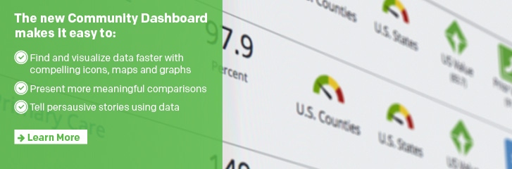
New Community Dashboards
Healthy Communities Institute (HCI)
has Enhanced and Improved the Community Dashboards!
Overview
Beyond the updated indicator gauge, our customizable HCI platform has enhanced community dashboards and indicator pages. We are simplifying data access, assessment, evaluation, and sharing for community members-even for those with little technical expertise. Tracking your impact on community health improvement has never been easier.
New Dashboards’ Core Capabilities
Visualize more data
● Present indicators on dashboards in classic rows or as designed, visual elements.
● Download and integrate simple and attractive charts and graphs that include indicator data and comparison icons into presentations, grant submissions, and reports.
● Quickly scan updated comparison icons, explained in a scrolling legend, which illustrate how a community indicator value compares to a distribution, a target value, a single value, or a prior value.
● Use color blind mode on dashboards for added clarity.
Compare indicators faster
● Curate which comparisons you present alongside indicators, including a distribution of state counties, a distribution of U.S. counties, a state value, a U.S. value, a prior value, the Healthy People 2020 Target, as available, and any custom targets and values you’ve
added into the Indicator Management System.
● Use the build a dashboard tool and the indicator page to present comparisons one at a time or side-by-side for added context.
● Map counties, zip codes, and census tracts within your service area to quickly pinpoint disparities and analyze positive or negative trends.
Search quickly for indicators
● Build a dashboard or search for an indicator or location from the community dashboard landing page to customize your search.
● Filter searches by location, topic, age group, classification, comparison or subgroup.
● Use the interactive map feature to select the locations of interest for a search.
● Review, save, and download full or customized lists of site indicators in list mode to highlight for which location-types there is data.
Customize metric tracking on dashboards
● Track changes to metrics by developing filtered and hand-picked
dashboards.
● Enable targeted interventions with dashboards that filter by location, population, classification, age-group, or comparison.
● Customize dashboards to highlight indicator values across specific or multiple locations.
● Use dashboards to assess progress against goals with multiple indicator comparisons or to single out performance on one set of goals.
● Create topic-specific collections of indicators to highlight community priorities.
Access more indicator-specific detail at once
● Evaluate indicator data for all available locations on the indicator page.
● Filter indicators on your site by specific age group or classification, such as Health Outcome, Health Behavior, Social Determinant of Health and more.
● View and export indicator comparisons overlaid on interactive maps into reports and presentations.
● Explore the indicator distribution, including low, high, median, and middle 50% values by location.
● Use breakout gender, age, and race/ethnicity charts to analyze indicator disparities.
● Select indicator values on interactive tables, maps, and charts for added context.